In this case, they are actually exaggerating. In my and David’s tests, the Samsung Gear S3 was able to go for 1.5 – 2 days with the screen going from being fully–on to the persistent low–power always–on state without issue. Battery life is actually very good in this device given its functionality. Incidentally, charging happens through a magnetic charging cradle that you have to connect to a regular phone charger via a micro-USB cable. Reviving a Samsung Gear S3 up to a day’s worth of charge takes about an hour or so.
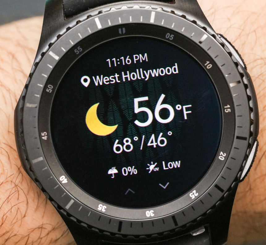
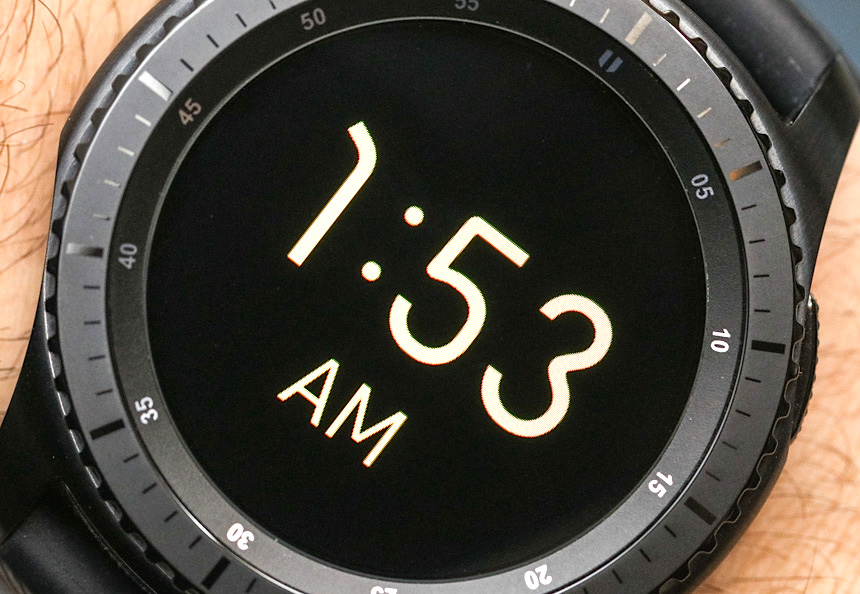
I mentioned that other smartwatches I’ve reviewed from brands like TAG Heuer to Casio have their own types of always–on states which allow the screen to not be blank. With that said, Samsung beats them for a few reasons. The screen on the Samsung Gear S3 in the persistent always–on state is colorful (not monochromatic as in others), bright given the OLED structure, and animated. This latter point is important because it not only means the information can change, but that you can have movement such as a moving seconds hand. For me, what is important is that the screen is highly visible, attractive, and viewable from across the room. That’s a big deal in my book. [David’s note: I recall taking pictures of the Samsung Gear S3 at the of the August debut and waiting for the screen to switch to the Always-On mode. It was still so bright and legible that it took me a while to realize that what I was looking at was already the reduced power mode.]
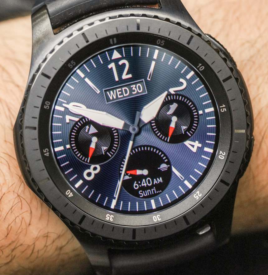
When the screen is in the fully on state the dial is, of course, even brighter and more attractive. Samsung designed many of its dials to incorporate information from the accelerometer. Why? Well, when you move your hand, some of the screens mimic the sense that the screen is metal and reflecting light. It is a very subtle yet powerful touch which I think will go a long way in many people’s books when it comes to overall product attractiveness.
Never A Blank Moment
Samsung includes a nice assortment of classic to sport dials in the Samsung Gear S3, but they still haven’t figured out branding. Easily the most interesting omission from each of their otherwise high-quality watch face designs is the lack of a “Samsung” logo anywhere. When speaking with their team about this, many seemed to have never even considered it – yet another example of a cultural disconnect between the tech world and the traditional watch world. People like to be reminded of the brands they choose to buy and wear. Also, from an aesthetic perspective, having a name on a dial really helps round out the design.
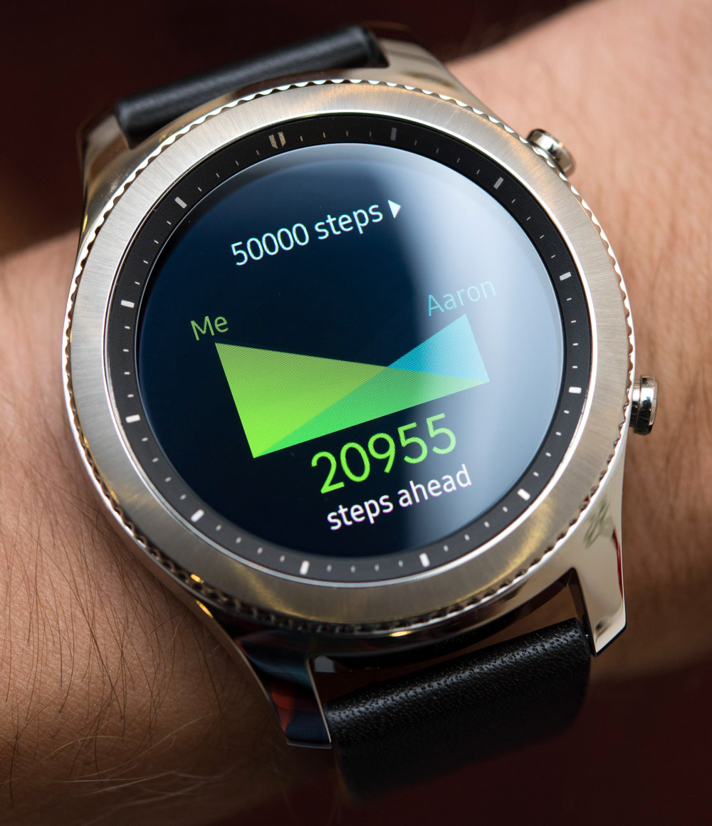
Most of the dials that come preloaded on the Samsung Gear S3 are connected to various activity features of the watch related to health and exercise monitoring. The watch comes with a heart rate monitor sensor built into the back, and the included software that helps track your activity throughout the day is similar in its notifications to that of the Apple Watch, but the personality and nature of the messages are quite distinct. David will discuss that later.
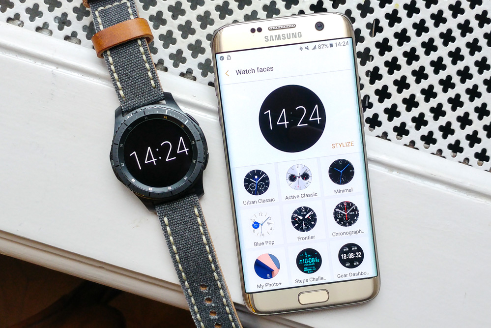
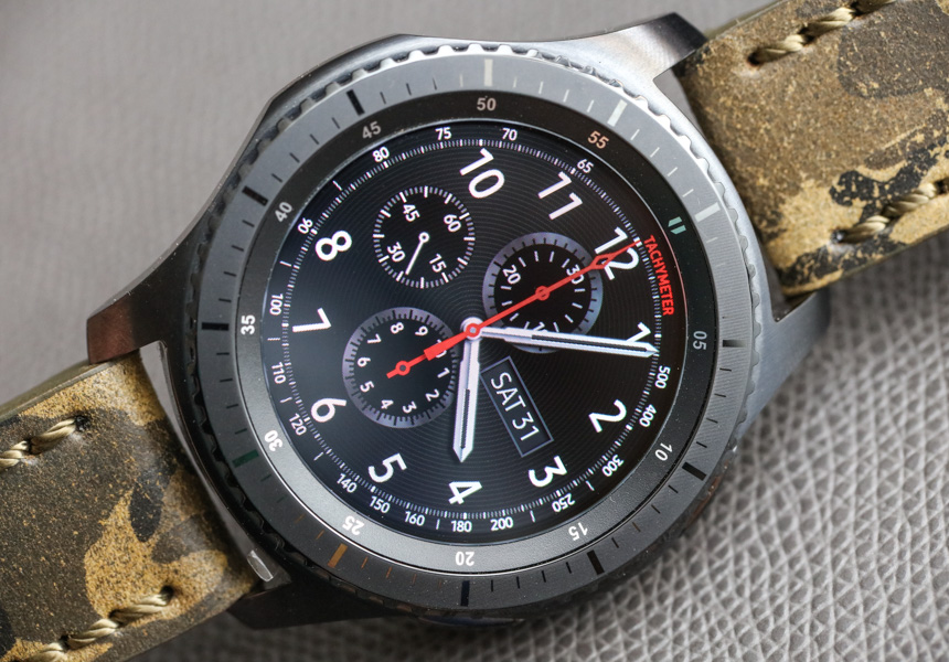
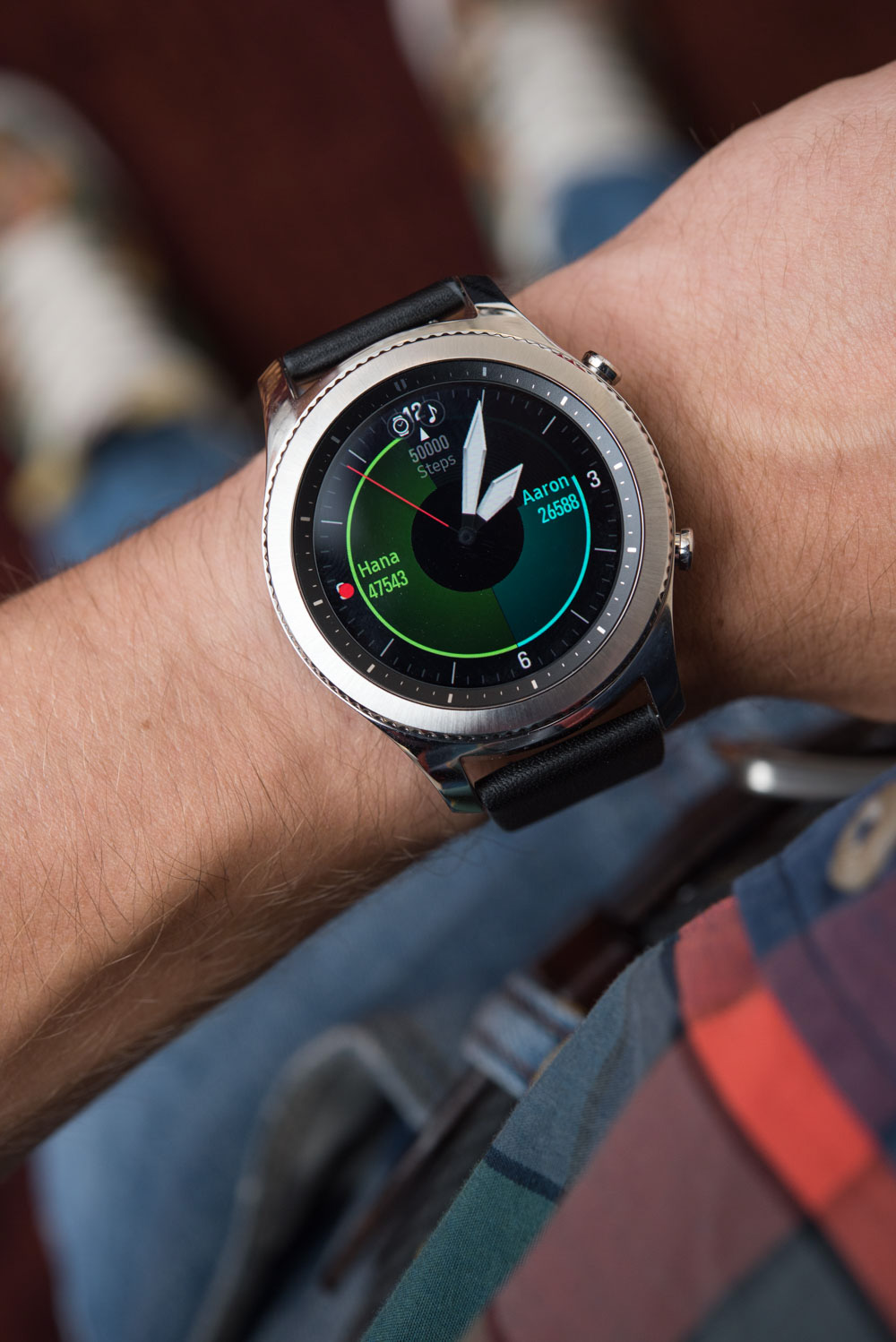
Coming from the world of traditional watches, my primary means of judging the dials is how cool they look. Most of the activity–themed dials which overlay the time on various information about your activity or exercise are genuinely well thought-out and useful. However, most are a bit too colorful and toy-looking to feel like serious fashion statements. So, all in all, it is good that Samsung offers a few more mature-looking dials as well. Of course, the good news is that switching between dials is really easy.
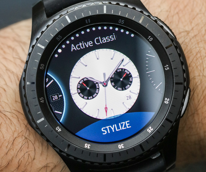
Therein lies the ultimate promise which is impossible to review completely, but essential to mention. Samsung invites you to download additional watch faces for the Samsung Gear S3 that can be produced by anyone. Yes, most of the available third–party watch dials out there are simply awful in design. But then again, that’s like all open development software platforms. While a lot of available dials will stink, enough will be good options. Apple continues to not only prevent others from meaningfully developing proper watch dials for the Apple Watch, but doesn’t even offer its own Apple-made selection of alternative dials to download. I simply don’t understand that, and feel that one of the primary values of having a smartwatch screen is being able to constantly change and personalize that screen. The artistic value is almost limitless, and I highly encourage people who get the Samsung Gear S3 to regularly play with and test new watch dials.
A Case From The Traditional Watch Industry
If you recall the launch of the Samsung Gear S3 then you’ll remember that Yvan Arpa was there. The prolific watch designer and Swiss watch industry executive is someone that I’ve know and been quite friendly with for years. He has worked at or run brands like Omega, Hublot, Romain Jerome, and his own brands Artya and Spero Lucem. Here is a guy who has been responsible for exotic mechanical tourbillons and was also asked by Samsung to help them make the Samsung Gear S3 look a lot more like a traditional watch versus a tech gadget.
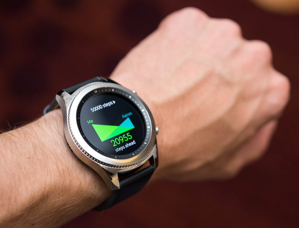
The Samsung Gear S3 is actually some of Yvan’s most conservative work, but I think he did an excellent job. His main goal was to not only replicate the experience of wearing a traditional watch, but to also help the Samsung Gear S3 look as nice as possible. He further had to do with both versions of the Samsung Gear S3 which include the Samsung Gear S3 Frontier (the one I prefer, given my personal style), and the Samsung Gear S3 Classic. Both models are the same size and produced from 316L steel with IP68 water- and dust-resistance rating, meaning the Samsung Gear S3 can be submerged into water 1.5 meters deep for up to 30 minutes. The Samsung Gear S3 Frontier has a black coated case with sportier inset pushers and a more instrument-style rotating bezel. The Samsung Gear S3 Classic has a polished and brushed case with more retro-style plunger pushers.
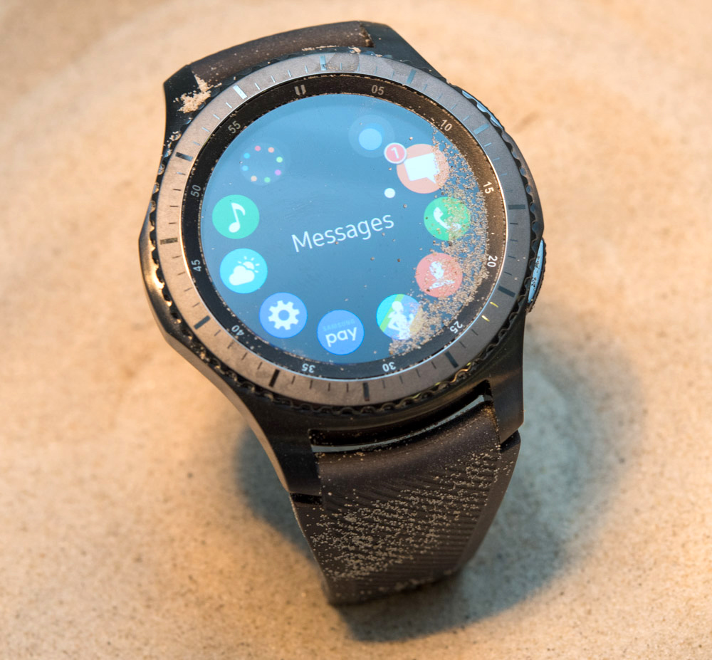
Yvan’s goal was, as I mentioned, to make the watches more visually proportionate. The Samsung Gear S3 is actually larger than the smaller Gear S2, but it looks more cohesively formed from an aesthetic perspective. At its widest point, the watch is almost 50mm wide, and it has a lug-to-lug distance of about 52mm. The case is about 18mm thick. With that said, the watch doesn’t feel as large as it is, and the way the case-back as well as the bezel taper tends to visually reduce mass. On a secure strap anyone care wear it, although the Samsung Gear S3 has been criticized by some female reviewers that it is too large for their wrist. I don’t really know what to say about that except that size in a technology product isn’t just about mere aesthetic choices. Here, Samsung needed to juggle a lot of factors including the size of the hardware, the touchscreen, the battery, and of course, the overall proportions of the case. I can say that if the Samsung Gear S3 watch were narrower or had stubbier lugs but maintained the same case thickness, it would not look nearly as good as it does.
You Bezel Believe It
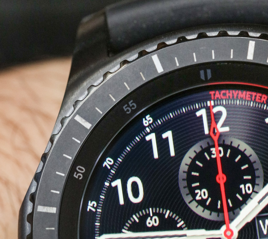
Traditional watch lovers take things like rotating bezels for granted, but their application in the smartwatch world is a bit more novel. The Gear S2 introduced a rotating bezel as a navigational control for the operating system, and the Samsung Gear S3 makes even better use of that. Part of that is by designing a bezel that mimics the feel of those on traditional watches. Even rotating feels good as small magnets are used to create the sensation of a click or stop at important points when screens are moved or you advance from one menu item to another. Apple has its digital crown and Samsung has its rotating bezel. Both are excellent systems, though the bezel is more easily accessible when the watch is on the wrist.
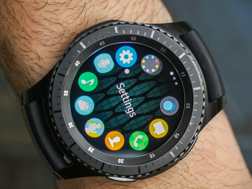
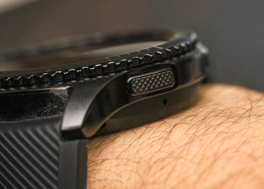
Input controls for the Samsung Gear S3 include the touchscreen, two case pushers on the right side, and the rotating bezel. I really like that you can do so much with the rotating bezel not only because it is comfortable to use and naturally intuitive, but also because it allows you in many instances not to physically have to touch the screen and block the view. The Gorilla Glass screen is not too bad when it comes to being a fingerprint magnet, but given that I am particularly keen on having smudge-free watches, I like how many things I can do (such as dismiss notifications) using the bezel and not having to touch the screen. I love the bezel on the Samsung Gear S3 and fully anticipate this to be a feature that sticks around for many subsequent Samsung Gear smartwatch products.
Strap–On, Strap–Off
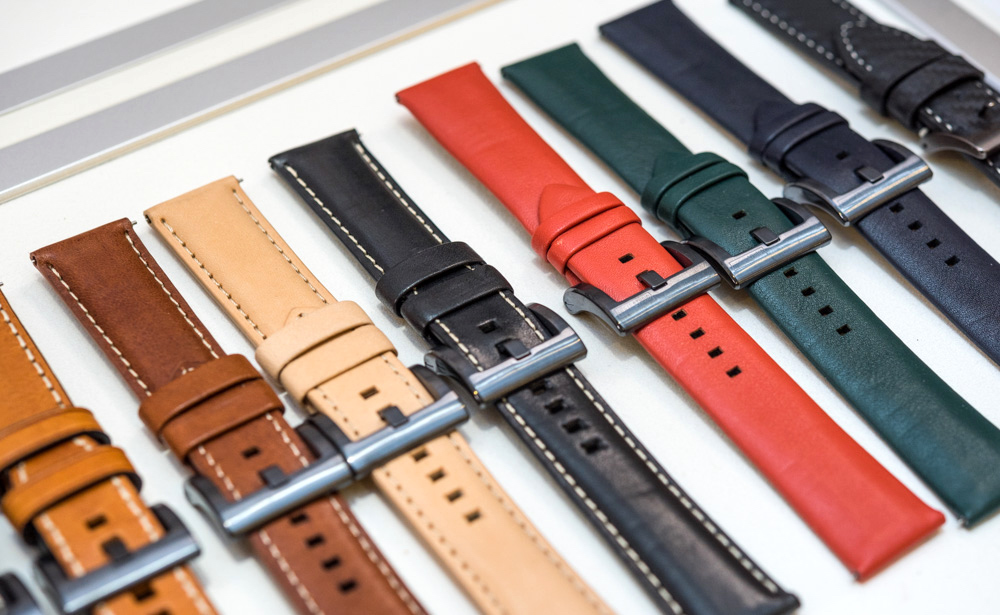
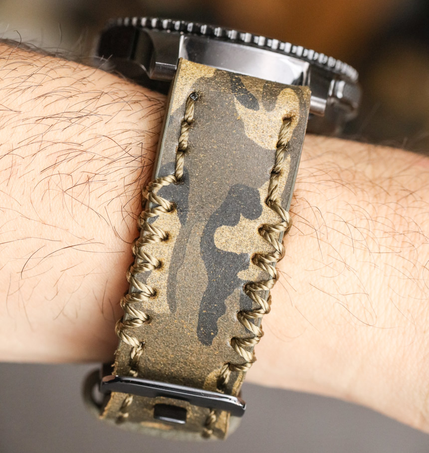
Being able to change the strap on a smartwatch – or any watch, for that matter – is nothing new. I just wanted to remind people that the 22mm-wide strap size on the Samsung Gear S3 is totally non–proprietary, meaning that wearers have a universe of strap options to choose from. Samsung itself sells a lot of attractive strap options for the Samsung Gear S3, and they are pretty decent. I like that in the box the stock rubberized strap comes with both a short and long segment depending on your wrist size. The spring bars also feature a handy tool-free finger latch which makes it very easy to remove the strap without effort. I can’t necessarily say that for all third-party straps you’ll get for the watch, but the good news is that you don’t need to purchase straps with proprietary case attachment systems designed to keep you locked into a particular product universe. Samsung knows that being able to change straps is a customary and time-honored (no pun intended) means of making a watch more personalized to the wearer, and they’ve not put any barriers in the Samsung Gear S3 to doing so.
Before David gets to his part of the review discussing functionality and more of the built-in sensors and features of the Samsung Gear S3, I’d like to close with a few final thoughts. I’m a special case as a user because part of my job is reviewing watches professionally. That means I can’t really say things like “I wear this watch all the time,” or “easily my only watch.” That would be a lie because part of my job is constantly wearing different watches, and I also happen to have a broad personal collection of timepieces that need attention. That noted, the Samsung Gear S3 is an extremely good smartwatch because it scores so highly in so many of the important requirements and categories that I have discussed above. Now, it is time for David to take over.

