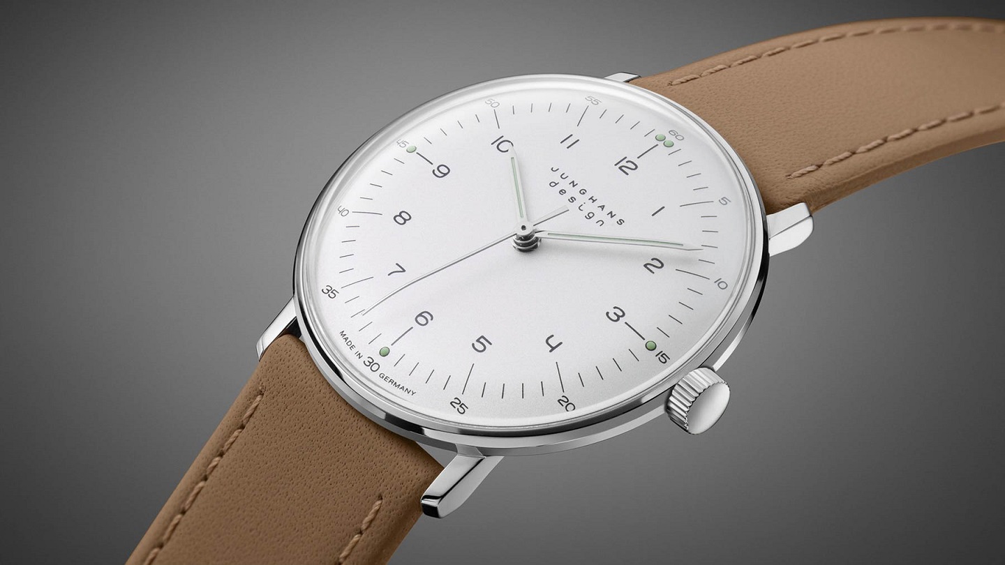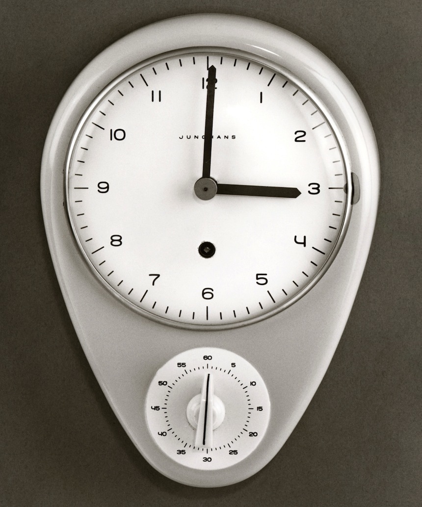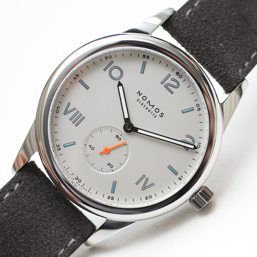
The design term “minimalism” is thrown around an awful lot in today’s market for wristwatches. Actually, “minimalism” is used in all sorts of consumer contexts these days. In my opinion, a lot of companies who make watches (among other things) are abusing the term – and doing a disservice to objects that do indeed represent effective minimalism.

Several times a week aBlogtoWatch gets messages from new brands that heavily emphasize the term “minimalism” to describe their new products. At a glance I see a product that looks incredibly familiar. Not only that, but a look that I dismissed long ago as being almost entirely uninteresting. Was I someone who just didn’t like minimalism? For a while I was starting to believe so. How could I simply write off an entire genre of design like that?
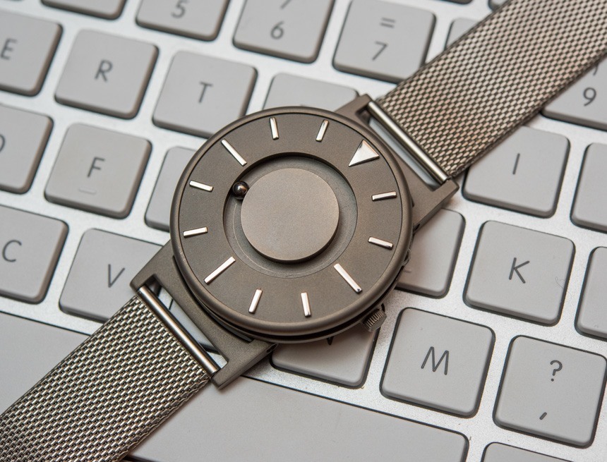
Eventually I realized that no, Ariel Adams is not perturbed by minimalist design in any way. In fact, Ariel Adams is a big fan of many effectively minimalist objects and watches. The problem wasn’t minimalism. The problem was that all those watches and so many other products out there which claimed to be minimalist were misusing the term. They should have been saying something entirely different to begin with. They should have just been calling their products “simple.” And to me – a seeker of exemplary objects in many forms – “simple” tends to almost always translate into “boring.”
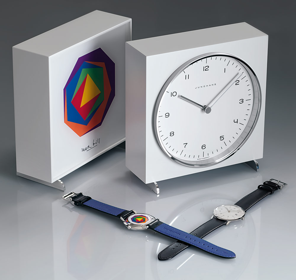
Minimalism is a style of design which by definition implies that some actual design is necessary. Minimalism as a design principle is about the effort of stripping something down to its essential elements, or lines. Such lines and elements create clear and effective representations of ideas and themes. To understand good minimalism, look at street and other municipal signs. They are designed just enough to effectively convey a particular piece of information, and nothing more. In a minimalist design, the designer attempts to emphasize just one or a few key ideas and themes. Minimalism is in a sense the art of telling a specific message very effectively. The most valuable incorporation of minimalist design has been to the graphic design and visual marketing industries – who carefully took lessons from the artistic design principle and utilized it for message conveyance to large audiences.
As you can see, minimalism is not about simplicity alone even though simplicity can arguably be an outcome of stripping down a design to its core elements. Simple means uncomplicated and without much depth. Good minimalist design isn’t an accident and requires a lot of careful study of form as well as intelligent incorporation of lines. If a minimalist design must rely on fewer lines than a more traditional or decorative design, each of those lines needs to count a lot more. Very little about minimalist design is actually simple, aside from the outcome of its efforts which to the viewer can often look deceptively so.
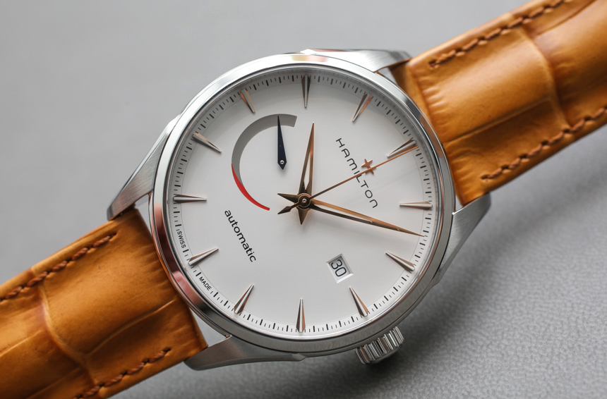
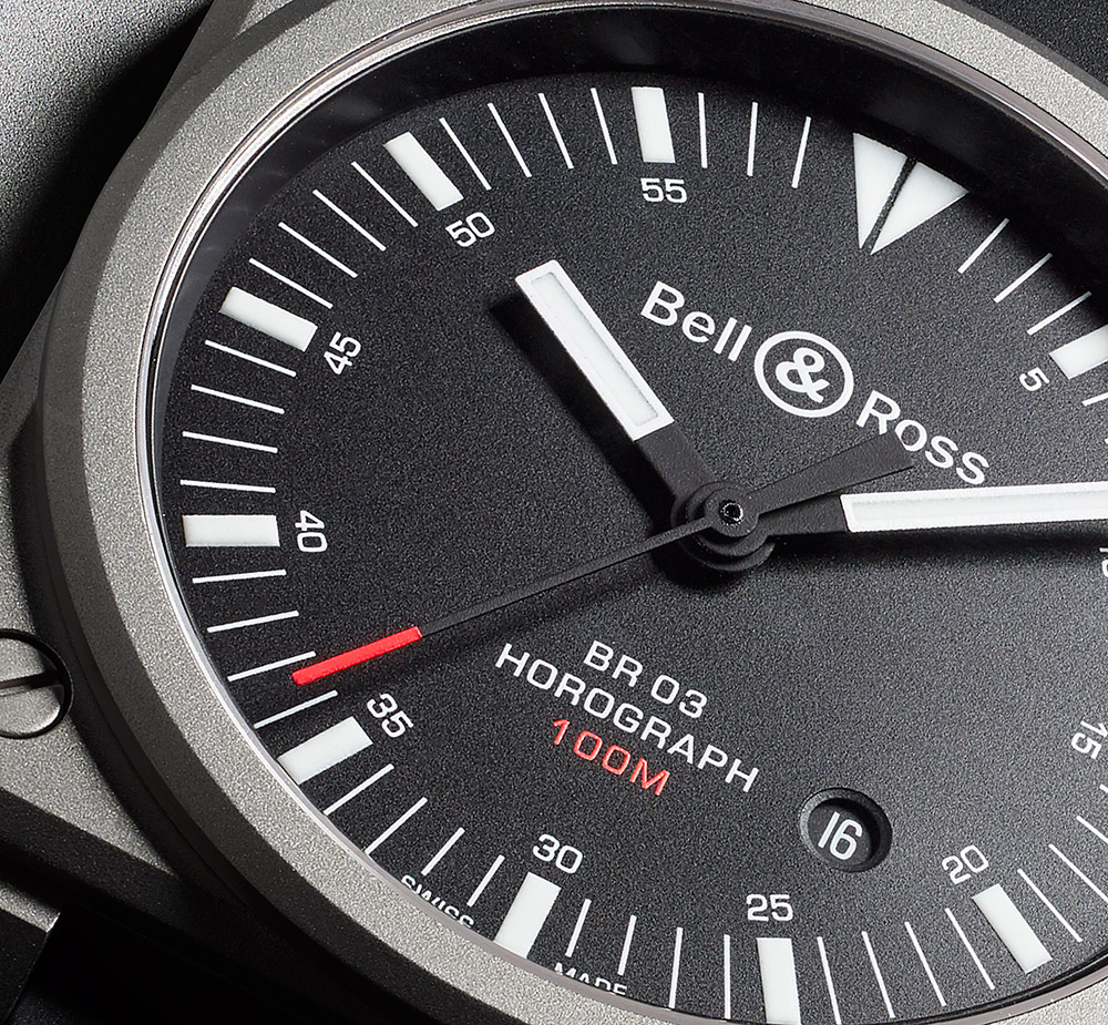
Simple things in contrast are unoriginal, non-distinctive, and without much character or personality. Simple things can often be easily confused for one another and rarely stand out in a crowd. One of the biggest misconceptions about minimalist design is that it cannot be loud, forward, or even obnoxious. Minimalism isn’t silence. It is just about using less to tell the same amount or more. Therefore, simple things by nature cannot communicate ideas or originality very loudly. Minimalist design objects on the other hand, can.
The reader of this article will not derive extra value from an elaborate description of all these claimed-minimalist watches that aren’t. These mostly always have thin, dress-style cases, basic time-only movements, dials with stick markers and hands, and an overall preponderance of inexpensive parts and production techniques. What merges all of these watches that bore me is just that – an almost entire lack of originality because whoever made them did so as cheaply as possible without any original parts or design elements.

