MING is a newly formed horological collective that just released their debut watch, the 17.01. The MING 17.01 is a watch with classic proportions but modern design. But, before we look at the watch, some context on the brand is necessary.
The observant reader would have noticed the use of the word ‘collective’ which is how MING brands itself. Composed of and entirely funded by watch collectors, MING has a few unique differentiators from the other new players we’ve seen recently. Firstly, there is the name – Ming is the name of designer and principal, Ming Thein. Ming has had a varied but long history in watches, from doing design and technical consulting work for some of the various big brands in the early 2000s to being one of the top watch photographers in the early 2010s, and finally to owning an eclectic collection of watches which includes some custom commissions.
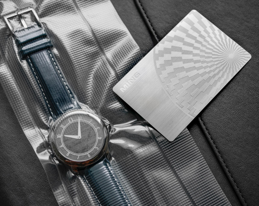
If you turn to the back of a JLC catalog from 2013-2014 or look at some of the images for Speake Marin, Maitres du Temps, and other independents, you’ll see Ming’s work. In recent years, he has also established a name for himself as a photographer and senior executive at a camera company in his spare time. Suffice to say, the brand is inextricably linked to the man – however, this is still a team effort and I’m told that the other partners are all seasoned watch collectors themselves. I’ve been told that this is the same group of collectors that are funding the brand, leading to the relatively unusual but welcome situation for a startup (and in the industry itself) where there’s zero gap between the announcement of a watch and availability of stock. For the more curious readers, the brand also has an interesting Q&A section on their site with more of their story.
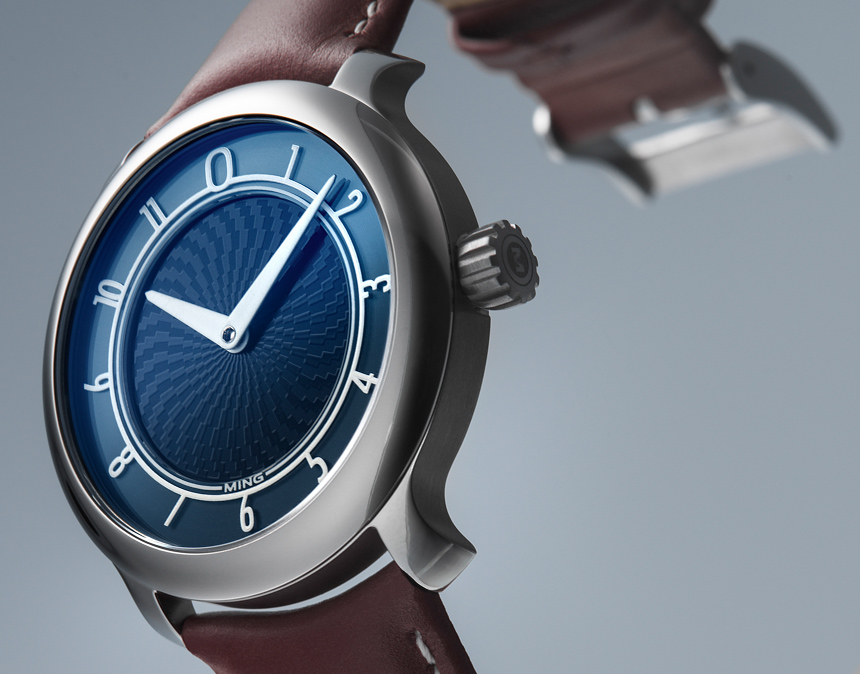
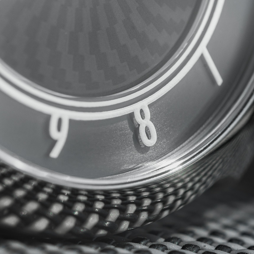
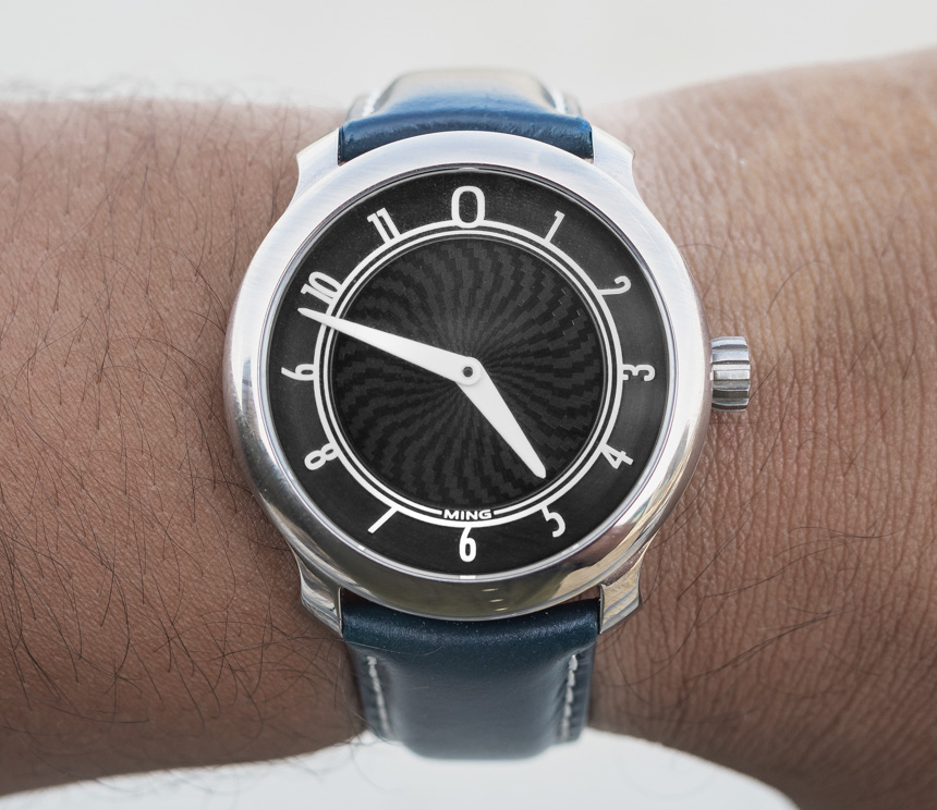
Let’s start with the most important aspect of the MING 17.01 watch, the design. The dial is multi-layered with the Arabic numerals appearing to float. This was achieved with the use of a sapphire crystal donut. The picture above should help illustrate this better but essentially, you have your base dial made from brass, sunburst finished, and then anodized to the required color. The central portion is printed with the spiraling fractal pattern and then a sapphire donut is placed over the outer portion of the dial. The hour markers and inner ring are printed on this donut. The best comparison I can think of is a sandwich dial. The effect of the sapphire donut is obvious when you have strong, directional light when the entire ring and markers appear to float on the surface of the dial and give it a surreal appearance.
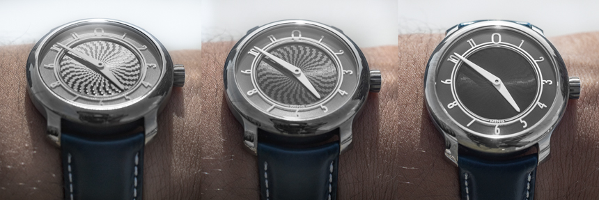
It does however, take some time to notice the floating numbers, because the pattern in the middle tends to steal the spotlight. Look at the watch dead on in the shade and all you see is a slate grey dial, but in the sun or at an angle, the dial starts to take on different personalities. Some of you may recall from my Seiko Samurai review, that an interactive dial is a huge appeal for me and the dial of the MING 17.01 reminds me of the Jaeger LeCoultre Reverso Latitude. Continuing this play on light and contrasts are the hands, which are sort of dauphine-shaped, simple, white in color, and offer great legibility.

Being a two-hander, there is no running seconds, which I suspect is a good thing because I can’t imagine how you’d design a seconds hand that is cohesive with the rest of the design and it’d probably get in the way of admiring the rest of the dial. If you look at my image above, you’ll see a nice little touch with the watch where the hour hand actually sits at the same level of the sapphire donut with the tip ending right as the donut begins. This makes the rehaut appear much shallower and the minute hand of course, sits on top of the donut and is sized appropriately. An interesting visual feature of the watch, is how the two hands always seem to maintain visual balance. I was initially expecting the watch to be too plain or imbalanced when both hands were in the same quadrant but this doesn’t seem to be the case in practice.
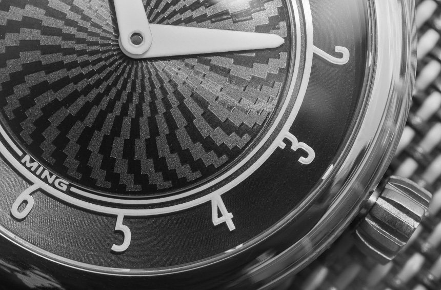
A favorite design element of the dial, for me, is the placement of the brand name. I’ve lost count of the number of times I’ve lamented the decision by watch manufactures who stick their brand name or logo smack in the middle of a well finished and textured guilloche dial and ruin it. In the case of the 17.01, MING has chosen to have this in a significantly smaller font size and integrated into the inner track at 6 o’clock. It achieves its job of branding the watch without looking like an eyesore.
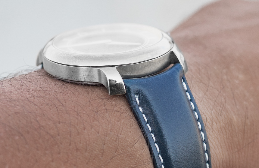
The other notable feature of the watch, after the dial, is the case – both design and material. You will have noticed the flared lugs, which I’m told will be a feature of future models as well. This is one of those riskier design moves I talked about earlier, but one that I find appealing. On the wrist, the flare isn’t so extreme that it looks gimmicky, instead it lends the watch a unique look from afar based on some of the comments I’ve received. The case is machined from titanium and is reminiscent of A. Lange & Söhne’s three-part construction comprising of a polished bezel and lug top, brushed case band, and circular brushed back held in place by six screws. It has a flat sapphire crystal that sits flush with the case band and I find that the single AR coating and lack of dome work well to reduce reflections.
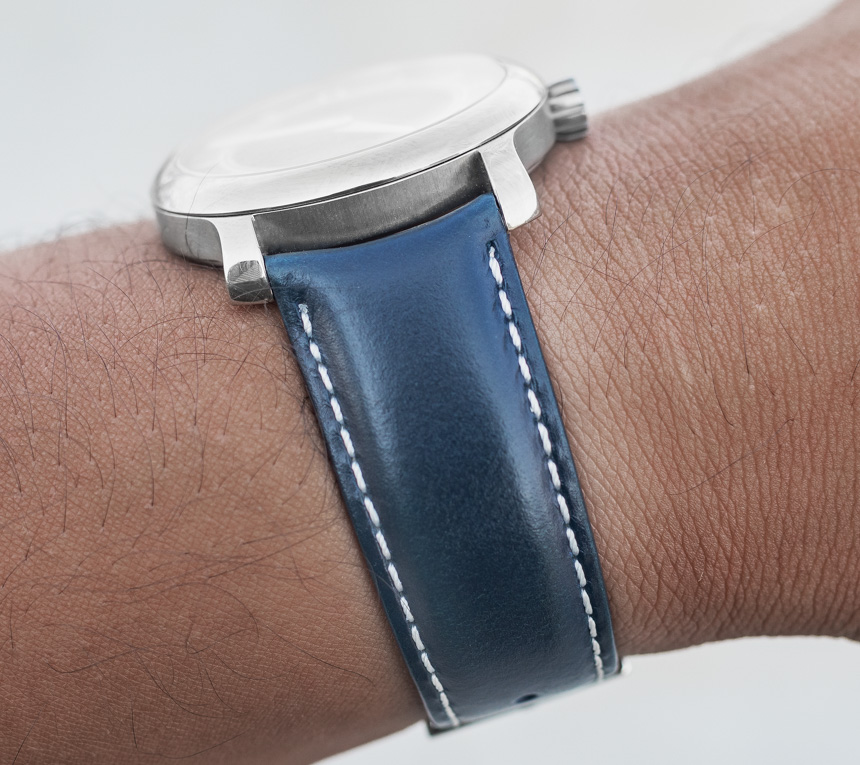
Considering the level of finishing achieved, I’m surprised they chose to use titanium for the case as it is harder to polish and finish well – especially at this price point. With a dimension of 38mm wide and 9.3mm thick in titanium, this watch is very light to the point where when I first put it on, I could’ve sworn the straps weighed more. It wears larger on the wrist and with a 7” wrist, I found the size was just nice and with the two-handed layout, the MING 17.01 works well as a daily wear dress watch. But, the dial keeps things interesting enough to pair it with more casual outfits too.
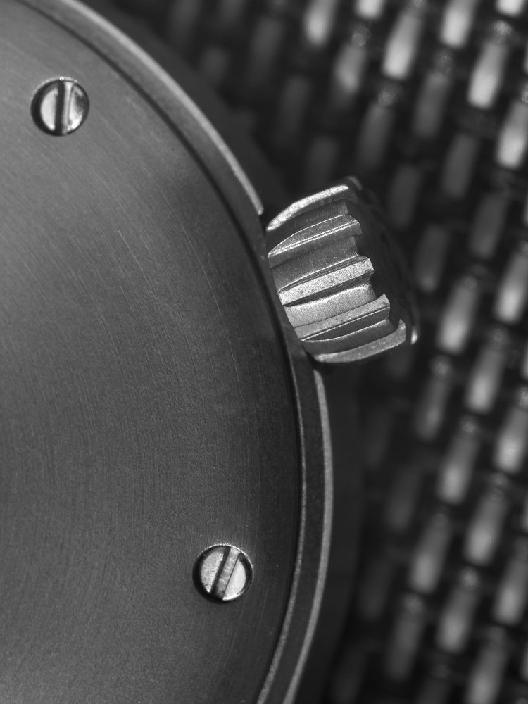
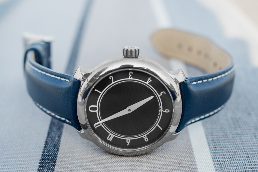
The crown is very ergonomic and winding the movement is an enjoyable experience – an important element considering you’ll have to do it each morning. The crown is not screw down, but is triple-gasketed to ensure the watch can achieve a 100m water resistance rating. An odd feature, and one I haven’t encountered before, is the case being filled with nitrogen during assembly. Apparently, this helps further minimize any risk of moisture entering the watch during assembly and causing damage over the long run. I’m not sure how significant this feature is and as you might imagine, it’s hard (possibly impossible) to verify.