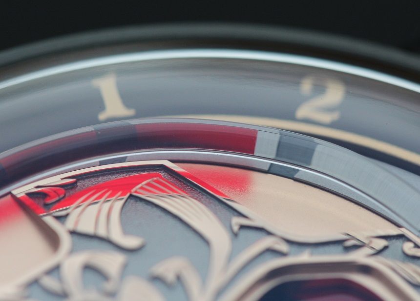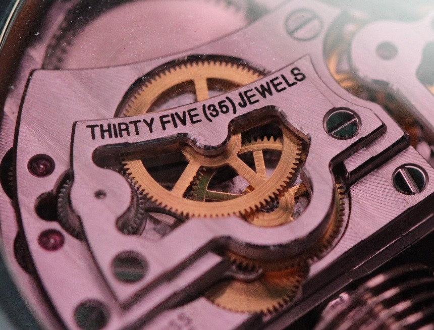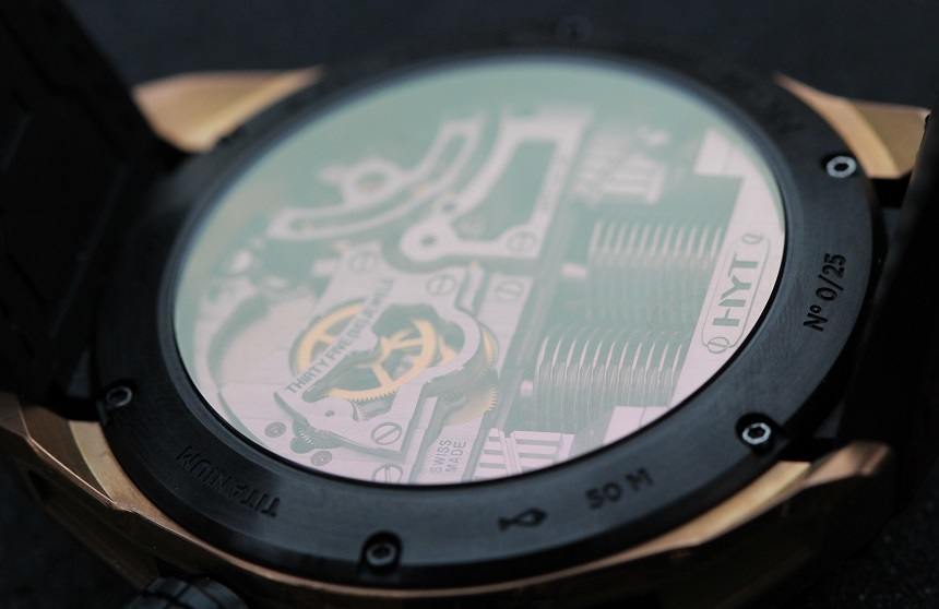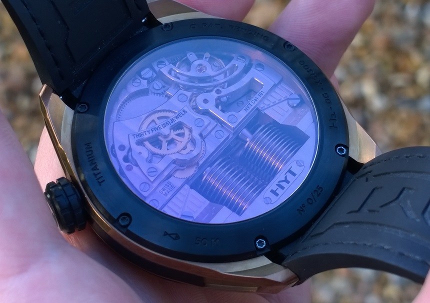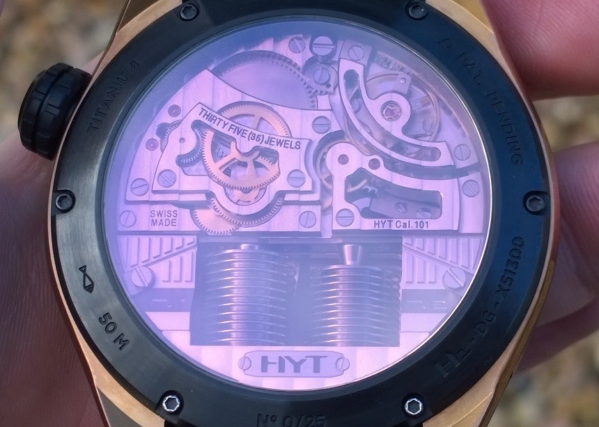
Moving on from front to back, the first thing that struck me was the rose-tinted color used on the display back – something that I have never seen before. I appreciate what HYT were trying to do in terms of chromatic congruence, but I would probably have preferred a clear crystal. Some might find the movement architecture a little blockish, but I love its relative simplicity – albeit with all those cut-outs and curves, it sure adds some more visual complexity to the overall layout… and, best of all, how could one ever get bored of the cool and unique bellows that pump the fluids through the capillary?
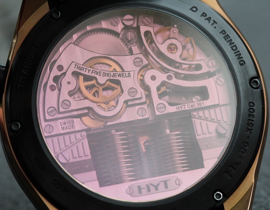
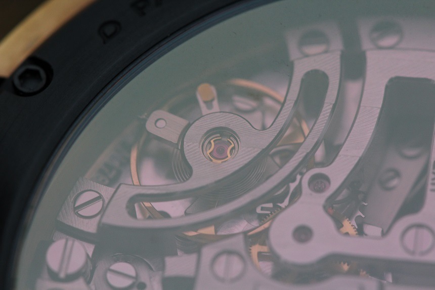
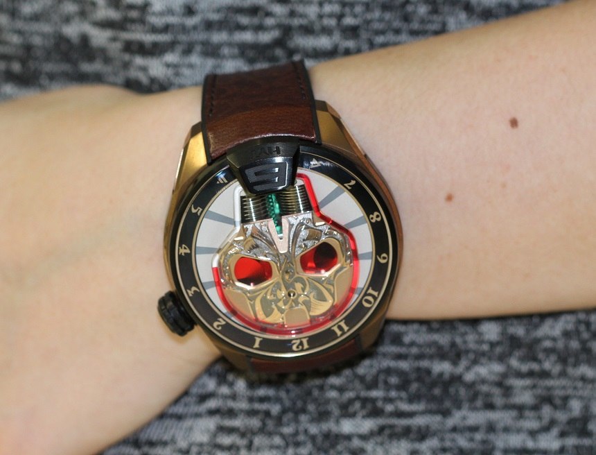
A weird side-effect of the rose-tinted case back is the effect it has on the bellows when viewed from the front. Because it’s actually possible to see straight through the watch, through the gap between the bellows, you get a glimpse of the underside of the rose-tinted anti-reflective coating that, from the front, appears green.
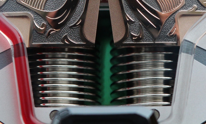
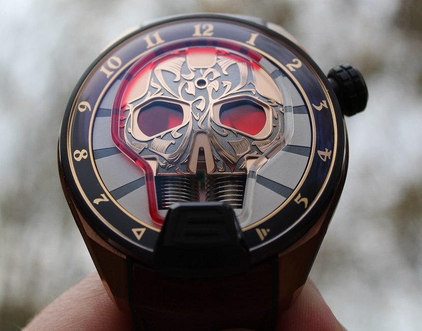
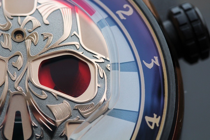
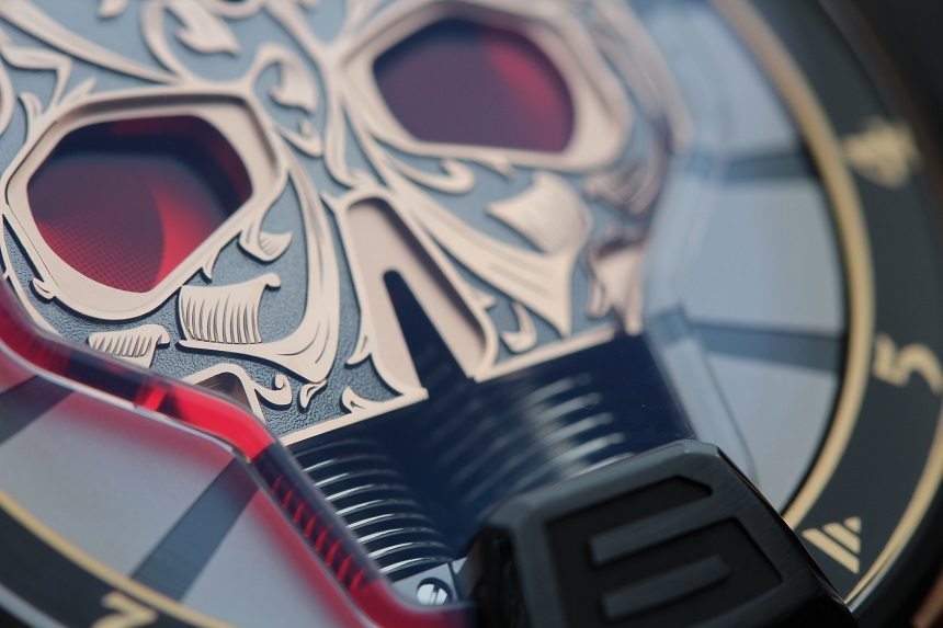
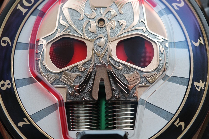
I wasn’t entirely sure what was going on when I first noticed this nuclear glow emanating from between the skull’s “teeth,” but I think this bizarre optical illusion is created by the anti-reflection coating in the same way a front crystal might sometimes appear blue from some angles. Blue-tints on front sapphires have kind of fallen out of favour in recent years (they are often the result of an inferior AR process than perfectly clear, or “white” crystals), but I have a soft spot for them. In this instance, though, I’m not sure I like the green-on-red result. It’s very festive, but I think good old-fashioned blue might have set off this palette a little better. Regardless of my opinion, though, it does add a cool element to the overall appearance of the dial.
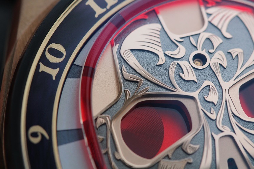
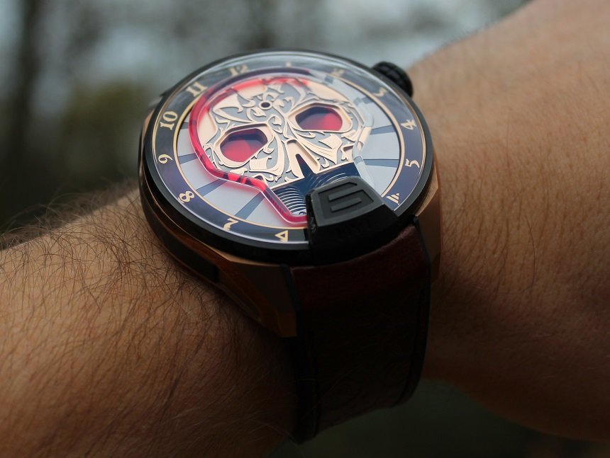
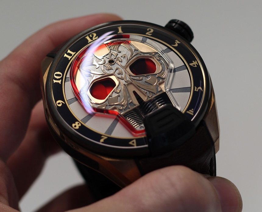
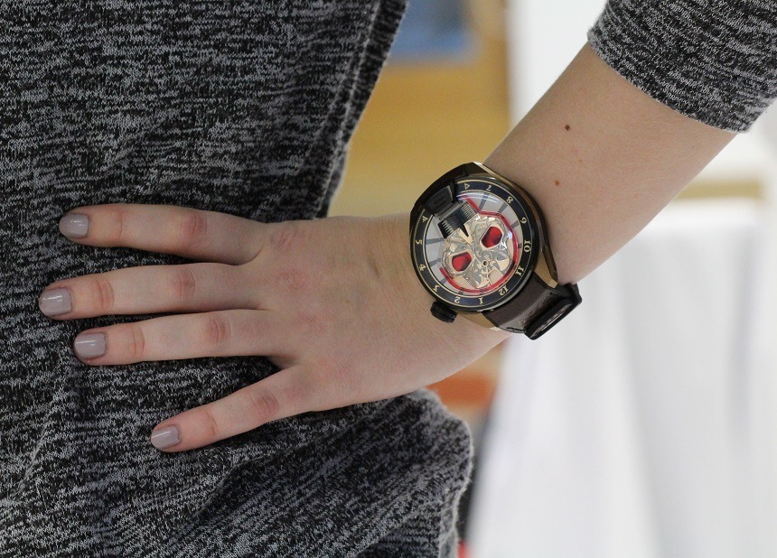
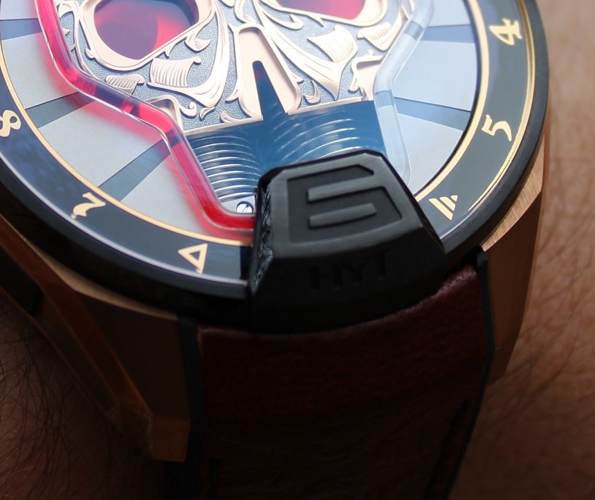
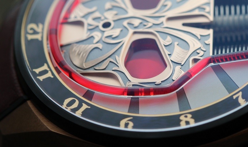
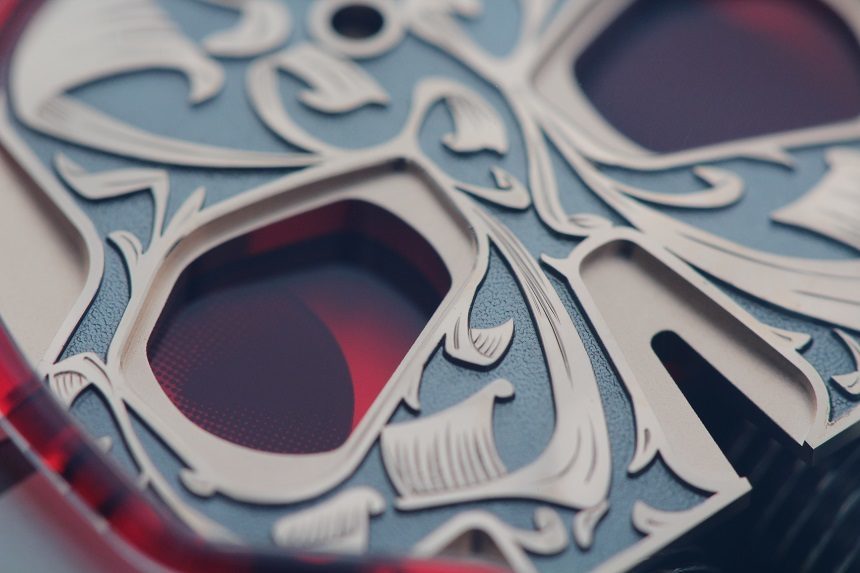
Should you dare to look deep into the Maori skull’s eyes, you will find that the left one hosts a running seconds disc and the left one a power reserve indicator. Both discs are printed with a black-white gradient. The power reserve disc moves so slowly it appears static, but the going seconds disc is visibly moving all the time, of course. I like the visual interest of movement – even if it is still very subtle – on what would otherwise be a very inactive dial. The centrepiece of this dial remains the hand-engraved skull – no surprises there. It’s significant for the brand, because it’s the first time HYT have employed old-world techniques, hand-engraving in this instance, in the styling of their watches. It’s an intoxicating fusion on which the success or failure of this particular piece rests: the skull itself is a very bold move displayed in a matching fashion, while the finer details of the engravings make you want to take an even closer look… only to then be mesmerized by capillary and the blood red fluid contained within.
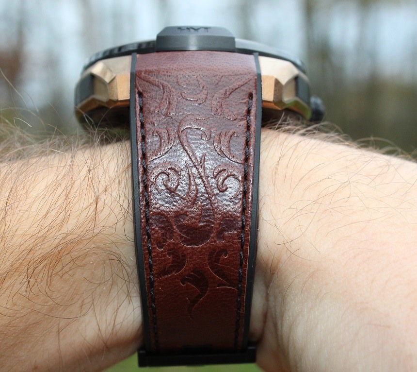
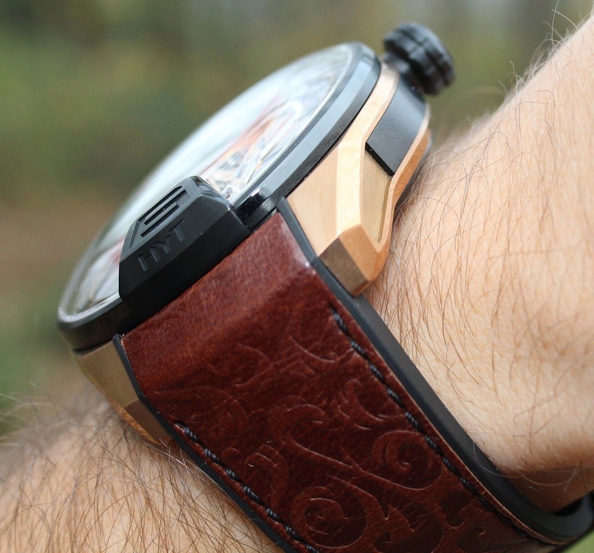
I’m a big fan of the colour scheme of this watch. Where the original HYT Skull watch looked a bit like an Ironman tribute act, this piece steps away and takes on a level of medieval ostentation that would probably be at home in the court of King Henry VIII. The glittering gold, the regal red, the warm brown… It’s a very lush affair and deliberately polarising in its design. With only 25 pieces available, it needn’t attract a massive consumer market, but it will surely receive plenty of scrutiny. In my opinion, it’s a great addition to the HYT Skull watches, but I prefer the models with a more traditional (read: high-tech) layout. This is a fantastic dress piece but certainly no beater – a fact that is hammered home by its $120,000 price tag. hytwatches.com
Necessary Data
>Brand: HYT
>Model: Skull Maori
>Price: $120,000
>Size: 51mm
>Would reviewer personally wear it: Yes.
>Friend we’d recommend it to first: Anyone who likes to talk about their watch – people WILL ask.
>Best characteristic of watch: Always hard to look past the fluid indicator, but the hand-engraved skull is exceptional and steals the show for me.
>Worst characteristic of watch: Although there’s no way to put a minute hand on this watch without ruining the design, the overall wearability drops a notch because of the omission.

